Creating Equiplot in R
R version of Equiplot.ado by Int’l Center for Equity in Health | Pelotas
This short code snippet demonstrates the process of creating an equiplot for visualizing health equity. Here’s a summary and step-by-step description of what the code does:
You need tidyverse, haven, and glue packages to run this session. To install them, run the following code in your R console:
1 Getting data
Next, we will do the following to get the data into R.
Load the necessary packages:
tidyverse. Forhavenandglue, we will not load them but use this,package::function().Create a temporary directory to store the downloaded zip file.
Download the zip file from the Equidade website.
Extract the contents of the downloaded zip file.
Read the extracted data file, “example_dataset_structure.dta”, into R.
Code
library(tidyverse)

# create a temporary file to save zipped file
temp <- tempdir()
zip_file <- here::here(temp, "equiplot-guide.zip")

# download zip file from equidade website
download.file(url = "https://www.equidade.org/files/equiplot-guide.zip",
                            destfile = zip_file)

# import data
raw <- unz(description = zip_file, filename = "example_dataset_structure.dta") |>
    haven::read_dta()
Let’s check the data.
| country | year | source | rQ1 | rQ2 | rQ3 | rQ4 | rQ5 | sii | countryn |
|---|---|---|---|---|---|---|---|---|---|
| Bolivia | 1994 | DHS | 1.22636 | 4.83719 | 11.88177 | 12.71847 | 9.88325 | 14.4 | 1 |
| Bolivia | 2003 | DHS | 5.91252 | 12.20895 | 16.38398 | 19.08344 | 17.54643 | 9.4 | 2 |
| Brazil | 1996 | DHS | 5.68750 | 10.30164 | 11.48771 | 12.43650 | 10.01661 | 6.2 | 3 |
| Brazil | 2006 | DHS | 14.74925 | 17.41648 | 17.58095 | 19.09717 | 12.96915 | -4.3 | 4 |
| Colombia | 1995 | DHS | 6.82985 | 12.25396 | 8.66815 | 7.98813 | 11.02944 | 1.6 | 5 |
| Colombia | 2005 | DHS | 9.66284 | 11.34591 | 12.16200 | 12.51274 | 11.31543 | -3.4 | 6 |
| Haiti | 1994 | DHS | 1.12229 | 0.57025 | 0.61240 | 2.09852 | 10.52705 | 11.3 | 7 |
| Haiti | 2005 | DHS | 0.69455 | 1.81220 | 2.97682 | 7.12898 | 12.97554 | 19.5 | 8 |
| Peru | 1996 | DHS | 3.04027 | 7.29176 | 11.33096 | 13.07306 | 15.77069 | 15.5 | 9 |
| Peru | 2004 | DHS | 3.35353 | 9.16911 | 16.07169 | 17.62576 | 15.82903 | 10.8 | 10 |
Reshaping data from wide to long format
Let’s change the data format so that it is much easier to create plots in ggplot2.
In the provided code above, the data frame “raw” is being processed using the pipe operator (|>).
First, the code uses the pivot_longer() function from the “tidyr” package to reshape the data. The columns “rQ1” to “rQ5” are transformed into two new columns: “level” and “coverage”. The values in the original columns are gathered into the “coverage” column, and the column names are extracted and placed in the “level” column.
Next, the code uses the mutate() function from the “dplyr” package to modify the “level” column. The str_remove() function from the “stringr” package removes the letter “r” from the beginning of each level. The case_when() function is then used to assign new labels to the levels based on specific conditions. For example, if the level is “Q1”, it is renamed to “Q1 (Poorest)”. Similarly, if the level is “Q5”, it is renamed to “Q5 (Richest)”. If none of the conditions match, the original level value is retained.
The resulting data frame “ex” now has the “level” column modified with new labels, representing different quantiles of coverage.
How pipe |> works
Imagine you have a set of instructions that you need to follow in a specific order. The pipe |> symbol is like a magic wand that helps you pass the results from one instruction to the next, without having to write everything down again.
For example, let’s say you have a toy car and you want to make it go faster. You have different steps to follow: first, you need to attach a turbo engine, then add bigger wheels, and finally, give it a fresh coat of paint.
Using the magic wand, you can say “Take the car and attach a turbo engine” (car |> attach_turbo_engine), then you can say “Take the result from the previous step and add bigger wheels” (previous_result |> add_bigger_wheels), and finally, you can say “Take the result from the previous step and give it a fresh coat of paint” (previous_result |> give_fresh_coat_of_paint).
The magic wand (|>) helps you pass the car from one step to the next, making it faster and more exciting without repeating the same instructions every time.
In programming, the pipe symbol works similarly. It allows you to take the output of one operation and pass it directly as input to the next operation, simplifying the code and making it easier to understand and follow the flow of data.
2 Equiplot
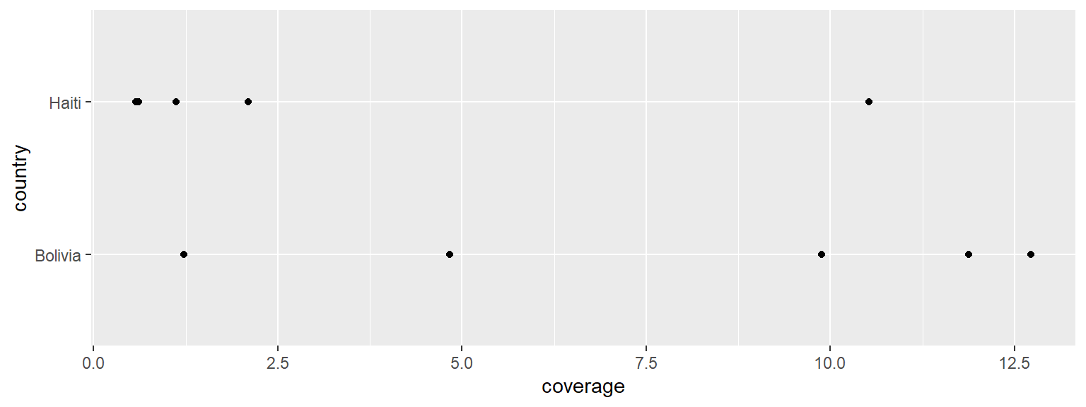
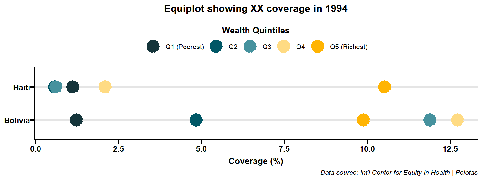
We will filter the data points for the year 1994 and create our boilerplate for equiplot.
Code
This looks very rough.
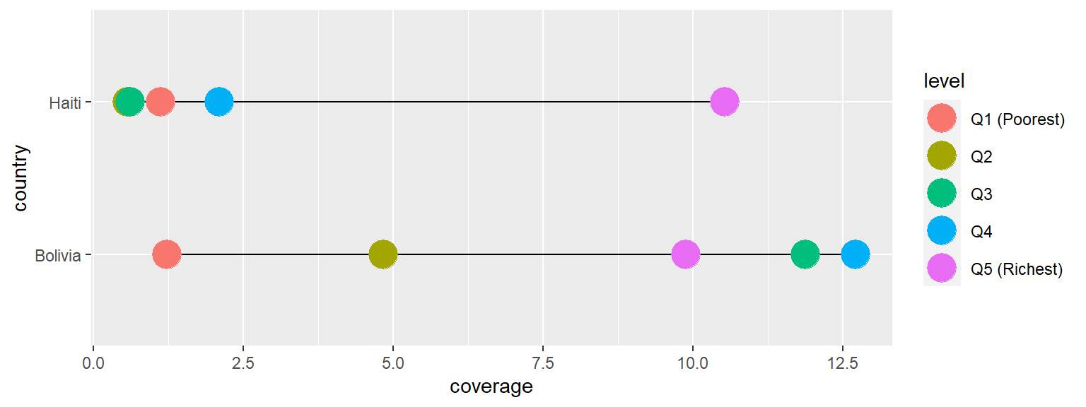
Next, we will add more aesthetics to it.
Code
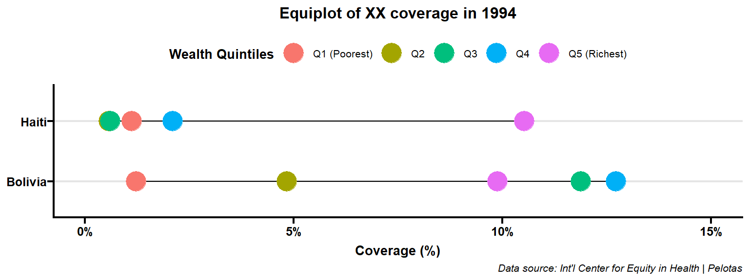
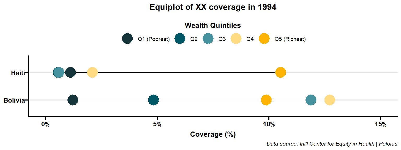
We want to make the plot more visually appealing so adding more looks.
Code
p <-
    ex |>
    filter(year == 1994) |>
    ggplot(aes(x = coverage, y = country)) +
    geom_line(
        aes(group = country)
    ) +
    geom_point(
        aes(color = level),
        size = 7
    ) +
    # limit x axis' min & max values
    # make the axis label look good
    scale_x_continuous(
        limits = c(0, 15),
        labels = \(x) paste0(x, "%")
    ) +
    # add more descriptive labels
    labs(
        x = "Coverage (%)",
        y = NULL,
        color = "Wealth Quintiles",
        caption = "Data source: Int'l Center for Equity in Health | Pelotas"
    ) +
    ## add title
    ggtitle("Equiplot of XX coverage in 1994") +
    # change the appearance of the whole graph
    ggprism::theme_prism(base_size = 10) +
    theme(
        # add horizontal grey line
        panel.grid.major.y = element_line(color = "grey90"),
        # italicize plot caption
        plot.caption = element_text(face = "italic"),
        # show legend title
        legend.title = element_text(),
        # change legend to the top position
        legend.position = "top"
    )
p
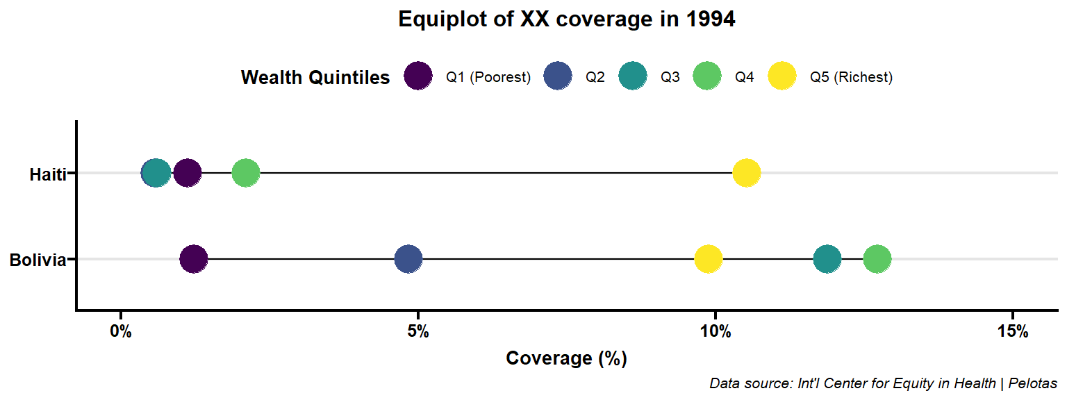
Refining more. change to custom colors.
Code
Complete code
Here is the complete code snippet.
Code
ex |>
    filter(year == 1994) |>
    ggplot(aes(x = coverage, y = country)) +
    geom_line(
        aes(group = country)
    ) +
    geom_point(
        aes(color = level),
        size = 7
    ) +
    # limit x axis' min & max values
    # make the axis label look good
    scale_x_continuous(
        limits = c(0, 15),
        labels = \(x) paste0(x, "%")
    ) +
    # change the color scale to custom colors
    scale_color_manual(
        values = c("#15353b", "#005766", "#46929e", "#ffdb83", "#ffb403")
    ) +
    # put legend title to the top over the labels
    guides(color = guide_legend(title.position = "top")) +
    # add more descriptive labels
    labs(
        x = "Coverage (%)",
        y = NULL,
        color = "Wealth Quintiles",
        caption = "Data source: Int'l Center for Equity in Health | Pelotas"
    ) +
    ## add title
    ggtitle("Equiplot of XX coverage in 1994") +
    # change the appearance of the whole graph
    ggprism::theme_prism(base_size = 10) +
    theme(
        # add horizontal grey line
        panel.grid.major.y = element_line(color = "grey90"),
        # italicize plot caption
        plot.caption = element_text(face = "italic"),
        # show legend title
        legend.title = element_text(),
        # change legend to the top position
        legend.position = "top"
    )
Reusable function
Writing the same code repeatedly is not efficient. To avoid this, let’s create a function that allows us to reuse the boilerplate code as much as we need. This will help us save time and effort. We can modify the code snippet according to our requirements and then encapsulate it within a function. By doing so, we can easily reuse the code with different datasets or variables.
Code
create_equiplot <- function(
        data, x, y, color,
        xlab = "Coverage (%)",
        ylab = NULL,
        title = "Equiplot of XX coverage in 1994",
        caption = "Data source: Int'l Center for Equity in Health | Pelotas",
        legend.title = "Wealth Quintiles",
        color_pal = c("#15353b", "#005766", "#46929e", "#ffdb83", "#ffb403")) {
    data |>
    mutate(x = {{ x }},
                 y = {{ y }},
                 color = {{ color }}) |>
    ggplot(aes(x = x, y = y)) +
    geom_line(
        aes(group = y)
    ) +
    geom_point(
        aes(color = color),
        size = 7
    ) +
    # change the color scale to custom colors
    scale_color_manual(
        values = color_pal
    ) +
    # put legend title to the top over the labels
    guides(color = guide_legend(title.position = "top")) +
    # add more descriptive labels
    labs(
        x = xlab,
        y = ylab,
        color = legend.title,
        caption = caption
    ) +
    ggtitle(title) +
    # change the appearance of the whole graph
    ggprism::theme_prism(base_size = 10) +
    theme(
        # add horizontal grey line
        panel.grid.major.y = element_line(color = "grey90"),
        # italicize plot caption
        plot.caption = element_text(face = "italic"),
        # show legend title
        legend.title = element_text(),
        # change legend to the top position
        legend.position = "top"
    )
}
Let’s create the same plot for the year 1994.
Code
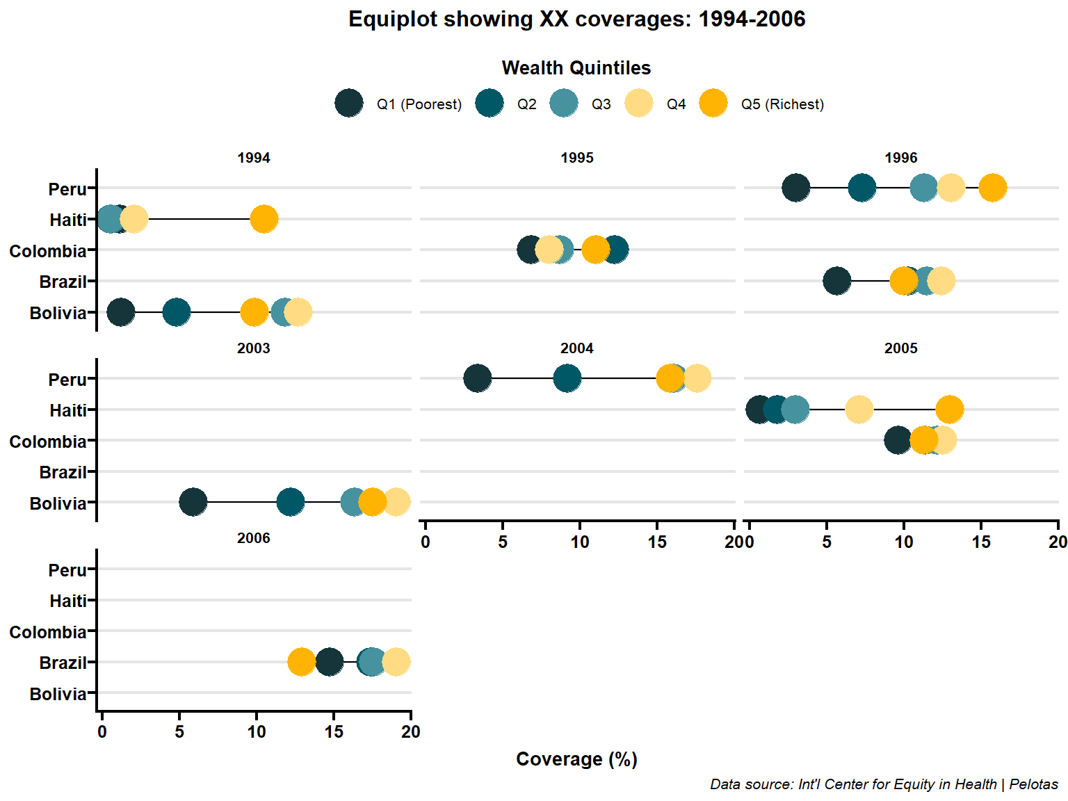
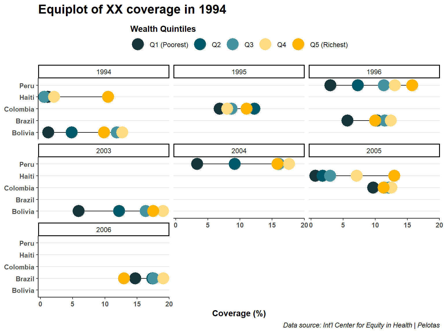
Adding faceted components based on the year variable can provide additional insights in our visualizations. Here are the updated codes that include faceting:
Code
We can customize the theme and labels to improve the appearance and clarity of the faceted graph. Here’s an updated version of the code snippet with a different theme and modified labels:
Code
ex |>
    create_equiplot(x = coverage, y = country, color = level) +
    facet_wrap(~ year) +
    theme_classic() +
    theme(
        panel.grid.major.y = element_line(color = "grey90"),
        axis.text = element_text(face = "bold"),
        axis.title = element_text(face = "bold"),
        plot.title = element_text(face = "bold", size = 16),
        plot.caption = element_text(face = "italic"),
        legend.title = element_text(face = "bold"),
        legend.position = "top"
    )
Saving plots
ggsave() is a useful function in the ggplot2 package that allows you to save plots in various formats. Here’s an example code snippet demonstrating the usage of ggsave():
3 Credits
Thank you, Fernando C Wehrmeister & Andrea Blanchard, for introducing me to the field of health equity and for facilitating the interactive and thought-provoking health equity workshop at the University of Manitoba on 27-30 July 2023.
Featured photo: Equity Dashboard by Int’l Center for Equity in Health | Pelotas
Example data & color scheme: Equiplot by Int’l Center for Equity in Health | Pelotas
Citation
@online{minn_oo2023,
  author = {Minn Oo, Myo},
  title = {Creating {Equiplot} in {R}},
  date = {2023-06-30},
  url = {https://myominnoo.com/blog/2023-06-30-equiplot/},
  langid = {en}
}
